so here's a tutorial for how i generally edit my photos!
(click on any photo to see it bigger)
to begin, i use a program called GIMP for editing. it's for free to download here. if you don't have that or don't feel like downloading it and you have photoshop, it's basically the same thing.
here's the unedited photo i'll be processing:
 i took it with my nikon d70s. sorry it's so grainy. also, for the super-dreamy effect that i have in all of my photos, i almost never ever shoot a photo with the sun behind me. i like it when the sun is low in the sky and behind my subject
anyway! moving on.
open the photo in gimp (or photoshop)
 .
.step 1.) first thing i always do is go to the "colors" tab at the top of the window, and then i select "levels". (in photoshop, i believe it's something like "adjustments," "colors," then "levels")
in the window that comes up, you'll see two different bars that go from black to white with arrows beneath them. for this step, we'll be using the one with three arrows. i always move the arrow on the right, under the black, to the center to create a really dramatic contrast, as pictured below:

step 2.) close the levels window. don't skip this step! close the levels window, and then go to colors>levels again to reopen it.
step 3.) this is what i always have the most fun with. toward the top of the levels window, there is the channel drop down menu that says "value", right next to the button that says "reset channel". click the arrow on the drop down menu and choose red.you can experiment around with any color combination you want, but this is what i opted for so far for this photo. i know it looks extremely and disgustingly red so far--bare with me. we've only just begun!
 for the arrow circled in red: bringing this closer to the center makes the highlights the color of whichever color channel you're on. in this case, it made the highlights red.
for the arrow circled in blue: bringing this arrow closer to the center made the lowlights more red.
for the arrow circled in green: bringing this closer to the center makes the lowlights of the photo a dark green, teal sort of color.
you probably won't be satisfied with the photo yet. don't worry! we've only done the red tones so far, and you can always go back to tweak everything to your liking.
step 4.) go back to the drop down channels menu again. this time, choose blue.

for this, i brought the left arrow closer to the center. just like it did for the red channel, doing this made the lowlights more blue. i did this to make it purpley! yay purple
step 5.) now, go to the green channel!
 for this, i made the highlights more green. the green and the red highlights together make them yellow.
so, at this point, we've been through all the channels. but i'm not totally happy with how the photo looks yet, so i'm going to go back to the previous channels and tweak a few things until i'm pleased with it.
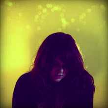
and here's the finished product!

and obviously, don't follow exactly how i edited my colors down to the exact placement of the arrows on the slides. do whatever works best for your photo and whatever makes you happy! there are so many color combinations that you can create other than purpleyfrillydreamypoo color processing that i used. experiment and play around and you might find something you really like.
anyway, that's all fo now
byebye
your adorable<3 izliz
ReplyDeletethis is a great tutorial, awesome work lizzy
ReplyDelete